Què? Com us heu quedat després de veure aquesta meravella d’infografia? Quina curarda i quin resultat més espectacular, no sé si hauran de fer-ne moltes més, però més val que el client les encarregui amb prou temps. Els creadors son Mie Frey Damgaard i Peter Ørntoft i el client és Jotun, un marca líder mundial de pintures decoratives.
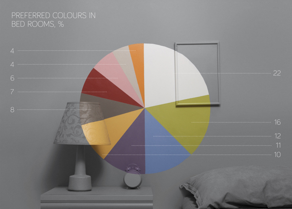
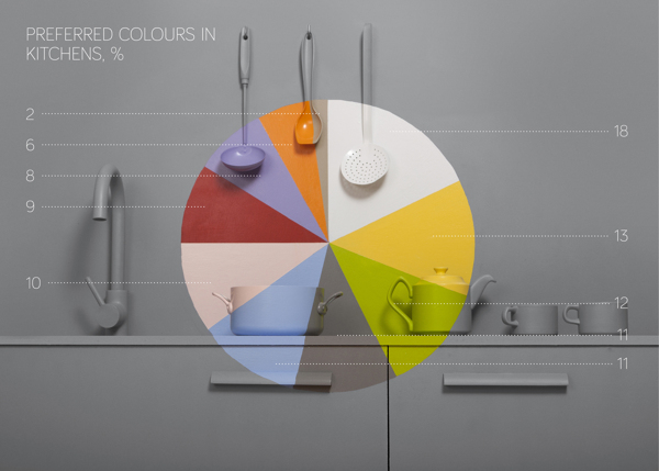
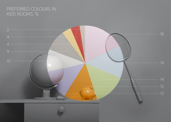
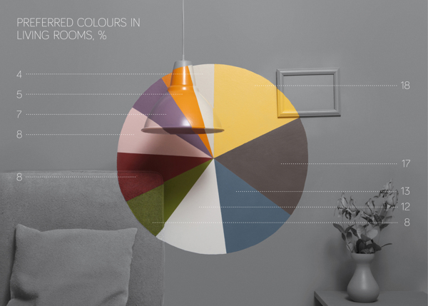
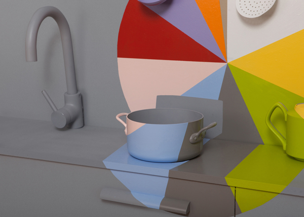
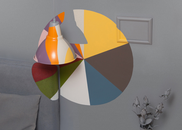
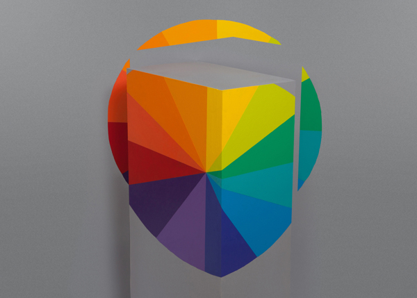
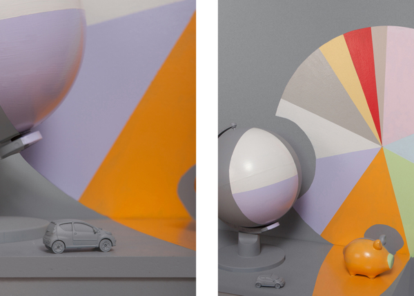
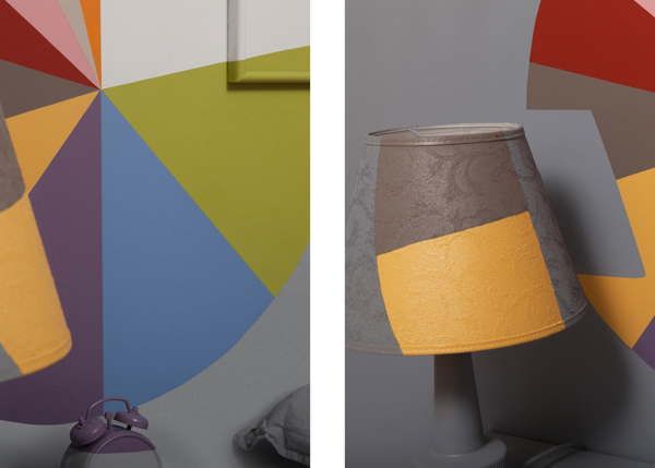
Jotun, one of the world’s leading decorative paints brand, simplifies the color selection process. This data visualization is the result of colour statistics extracted from Pinterest which is a rapidly growing content sharing platform effecting millions of consumers’ decoration decisions.
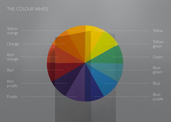
The data visualization is showing peoples relationship between colour and space in specific household areas. The concept for the visualization is to design the data of the survey by using the two key elements, colour and space, as tool and canvas to thereby establish a familiar relation between the user and the data. The diagrams use the context of the data to design the data itself and that allows the diagrams to show more layers of information about the statistics.
Trobareu més informació a facebook.com/jotunturkiye
[vimeo]http://vimeo.com/56284819[/vimeo]
Vist a 40Fakes.

Deixa un comentari