Design Mantic amb Evan Brown han creat aquesta infografia que reuneix una sèrie de consells molt útils per evitar la condemnació eterna dels nostres treballs. Segur que tots hem tingut dubtes alguna vegada sobre les tipos escollides, sobre les convinacions realitzades… Amb aquests 10 manaments segur que anireu una mica més tranquils la propera vegada.
Combining and choosing fonts is an art. Fonts do not come easy, but once you pull off the right typeface, it can make your graphics stand out and, who knows, that type may even come out as the most powerful element in your design!
Our previous infographic, Foodies Friction – The Logo Battle! had talked about how the different brands are always competing with one another and how their logos usually end up resembling each other so much. Now, we shall explore the much interesting topic of typography in the field of communication design.
It is true that the beauty of typography lies in its endless options, convenient variations and its colossal nature and that typography knows no boundaries and it’s like yet another galaxy out there waiting to be explored and known. However, even though, typography is open ended and vast with a lot of creativity to it, there is only so much one can do and apply. Hence, it is always good to know the tips to make unique logo design, web interface or packaging, in order to save yourself from the trouble of experimenting too many fonts on your design.
The infographic below illustrates the, “10 Commandments of Typography” that could be followed as quite the basics when it comes to selecting fonts. Even though typography is an art and art is supposed to be subjective with minimal parameters, these rules can still be applied in order to save time and too much experimentation! Consider the following 10 statements as the best practices of typography…
Recognizing the interest of diverse communities in our Infographic, we have created a Spanish version of the ‘10 commandments of Typography’. Checkout and let us know what you think in the comments below. [Note: Thank you Ana, Franrome, C. Sandes, Santiago, Marcos and all those who contributed for your invaluable feedback, you guys are awesome!]
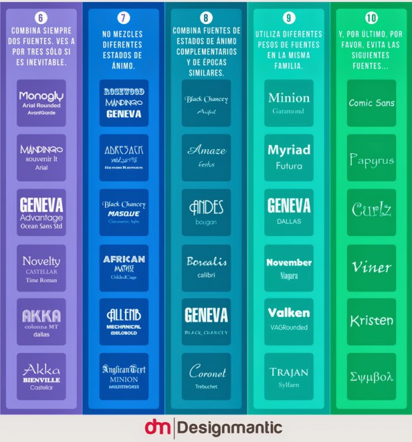
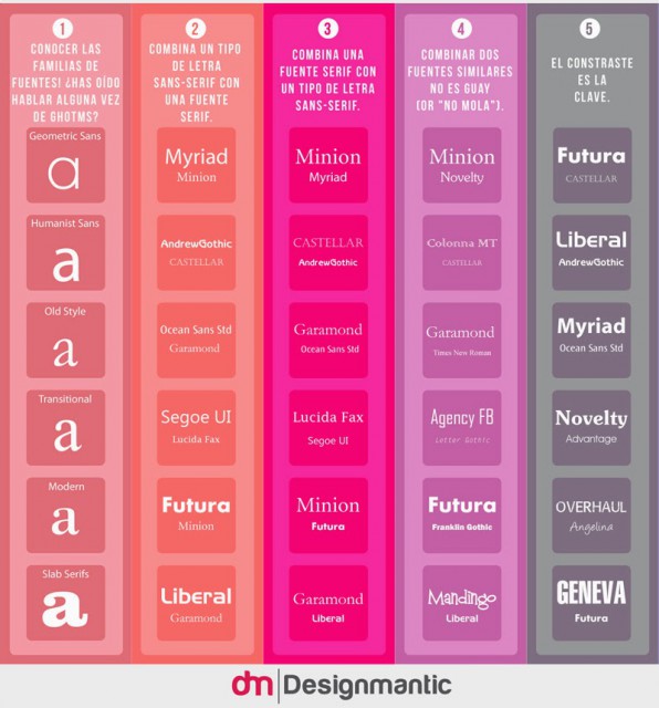
Els 10 manaments de la tipografia segons Design Mantic:
- Conèixer més famílies de fonts
- Combinar un tipus sans-serif amb una font serif
- Combinar una serif amb una sans-serif
- Combinar dues fonts similars no mola
- El contrast és la clau
- Combina 2 fonts, 3 si és inevitable
- No barregis dos estils molt diferents
- Combina estils d’èpoques similars
- Utilitza pesos (bold, italic, regular, medium) de la mateixa família
- I finalment evita les següents fonts: Comic, Papyrus, Curlz
Més info a: www.designmantic.com
Salut i tipografia!
![[Infografía]: Los 10 Mandamientos De La Tipografía](http://www.designmantic.com/blog/wp-content/uploads/2014/04/font-infography-spanish.jpg "[Infografía]: Los 10 Mandamientos De La Tipografía")
Deixa un comentari