Us he parlat diverses vegades del blog Fonts & Boobs. Defineixen aquest espai com: “T’agraden les fonts i els pits? Tipografies d’alta qualitat amb pollets bonics. Una eina útil per als dissenyadors gràfics.“
Com que és divendres he pensat que igual us agradaria una bona imatge i un bon recurs per acabar la setmana. Doncs això, uns pits ben macos i una tipo ben maca, la Tanger Sherif, amb moltes variants, sèries, packs…
Inspired by New Transitional and Egyptian fonts Tanger Sherif has elements of a sturdy work-horse text face and finely detailed headline font. A wide variety of widths and weights support many text sizes. Typically Narrow is used in headlines, Medium in body and Wide in smaller print.
Nothing is predefined, though. By combining the right widths with the right weights this traditional approach can easily be challenged. Let’s take an oversized (over 10 pt) body copy for instance. In conjunction with using a bigger size to enhance readability, a narrow and slightly lighter weight will save space and brighten text color. Tanger Serif Narrow is a slim normal rather than a condensed face.
As an Open Type “Pro” font each weight includes an expanded character set, small caps, old style figures, tabular figures, ligatures, fractions etc. All these are easily accessible through OpenType features. Note that some applications might not support all of them.
Tanger Serif was one of the winning entries representing the best fonts for the last 10 years at Letter.2 Type Design Competition by ATypI in 2011.
Més info a: Font tanger sherif photo
Salut i divendres!
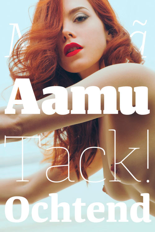
Foto: Corwin Prescott

No comments yet.