Per sorpresa meva vaig trobar una entrada al Fast Company al que ens parlan de quins són Els ingredients d’un gran logotip i de les Sis preguntes que ens em de fer al dissenyar una Marca. L’article està integrament en anglès i us el mostro tal qual el podeu trobar a Fast Company:
Your company’s logo is the foundation of your business branding. It is probably the first interaction that you will have with your customers. An effective logo can establish the right tone and set the proper ethos. After years of crafting logos for different projects, I’ve come up with a set of questions that I always ask myself before delivering a new logo.
1. WHAT EMOTIONS DOES THE LOGO EVOKE?
Above all design guidelines, the most important criterion is whether the logo reflects the character of the company. The emotions that the logo evoke should be appropriate to the company values. For example, the Disney logo evokes a sense of happiness and optimism. The curvy, fun typeface is appropriate for a company that has been making cartoons and animated pictures for kids. However, a similar logo style on a sales platform would not be appropriate.“BEHIND EVERY GREAT LOGO IS A STORY.”
Designers should understand the psychology of colors and the effect that typeface has on the design of a great logo. For example, green promotes relaxation and usually reflects growth, health, and the environment. Red, on the other hand, may evoke danger and passionate emotions. Similarly for typefaces, Garamond, Helvetica, and Comic Sans all elicit very different sentiments. Serif fonts like Garamond promote the idea of respect and tradition, and are hence more suitable for an environment that demands integrity such as a university or a news publisher. Sans Serif fonts like Helvetica are clean and modern, and are well suited for high-tech businesses. Casual script fonts like Comic Sans are probably best left for fun companies such as toy companies. A good understanding of the psychology of colors, typefaces, and shapes is an important part of making a great logo.
The styling of the Disney logo is appropriate for a company that aims to be fun, but such a style would not be appropriate for a sales platform company.
2. WHAT’S THE MEANING BEHIND THE LOGO?
Behind every great logo is a story. A great logo is not about slapping your business name on a generic shape, which is why choosing from ready-made logos is a poor idea. A logo has to have a meaningful story. A good designer first understands the culture of the company, the tone of the product, and the vision of the business, much before embarking on ideas for the logo. The end result of a quality logo is reflective of the philosophy and values of the company.
The arrow in the logo represents that Amazon sells everything from A to Z and the smile on the customer’s face when they buy a product.
“TO TEST A LOGO, LET IT SIT WITH YOU FOR A WHILE BEFORE RELEASING IT.”
3. WILL THE LOGO STAND THE TEST OF TIME?
How will the logo look in two, 10, 20 years? Designers should avoid getting sucked into flavor-of the-month trends. Trends like ultra-thin fonts and flat shadows are design styles that will probably not stand the test of time. Simple is far better than complex. A simple yet memorable logo can be used in 20 years without looking dated.A good way to test the logo is to let it sit with you for a while before releasing it. Some logos grow with you–the more you look at it, the more you like it. Some logos start to feel nauseating after a while–the more you look at it, the more you hate it. If after a couple of weeks with the logo you find it boring, the logo is probably not strong or timeless enough.
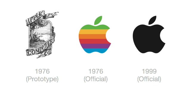
The simplistic outline and shape of the Apple Inc. logo allows it to endure the test of time. The first prototype of the logo would definitely not be suitable today.
4. IS IT UNIQUE? CAN IT BE INSTANTLY RECOGNIZABLE?
A great logo is distinctive, memorable, and recognizable. Even if you have only seen it once, you should still be able to remember what it looks like after a period of time. A good way to test this is to show your logo to a friend, then cover it up and have your friend describe the logo in a week. A fresh pair of eyes can be very effective in figuring out the most memorable components of a logo.In addition, if the logo reminds you of others you have seen, it is not distinct enough.
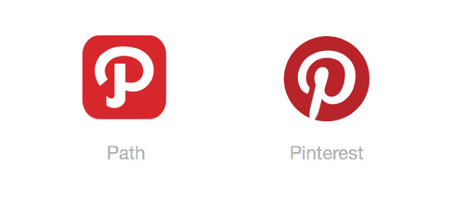
The logos of Path and Pinterest are very similar.
5. HOW DOES IT LOOK IN BLACK AND WHITE?
When I begin designing a logo, I always start in black and white. Designing with this limitation first forces you to make sure that the logo is recognizable purely by its shape and outline, and not by its color. A strong logo is one that is still memorable just by its contours.A one-color logo also provides the benefit of using your brand easily in multiple mediums with different backgrounds and textures.
It is much harder to recognize the National Geographic symbol once we remove its signature yellow color.
6. IS IT CLEAR AND DISTINCT IN SMALL DIMENSIONS?
Another way to make sure logos are simple and recognizable is to scale it down dramatically. Even at tiny resolutions, a strong logo should still be recognizable at a glance. This is also a good test to make sure that the logo is not complicated with unnecessary design flourishes. Here, you see that the Nike, McDonalds, Twitter, and WWF logos are still very distinct at small sizes. The GE and Starbucks logos are far more cluttered, and less recognizable when they are small.
These are not hard-and-fast rules, just guidelines for making an effective logo. It is still possible to make a strong, complicated logo, but understand the trade-offs.
Doncs ja teniu una altra petita ajuda per poder fer front a un disseny de Marca. Quina sort tenim de les reflexions dels companys i companyes de professió.
Més info a l’article original: The Makings Of A Great Logo.
Salut i ingredients!


Deixa un comentari